Branding & Identity
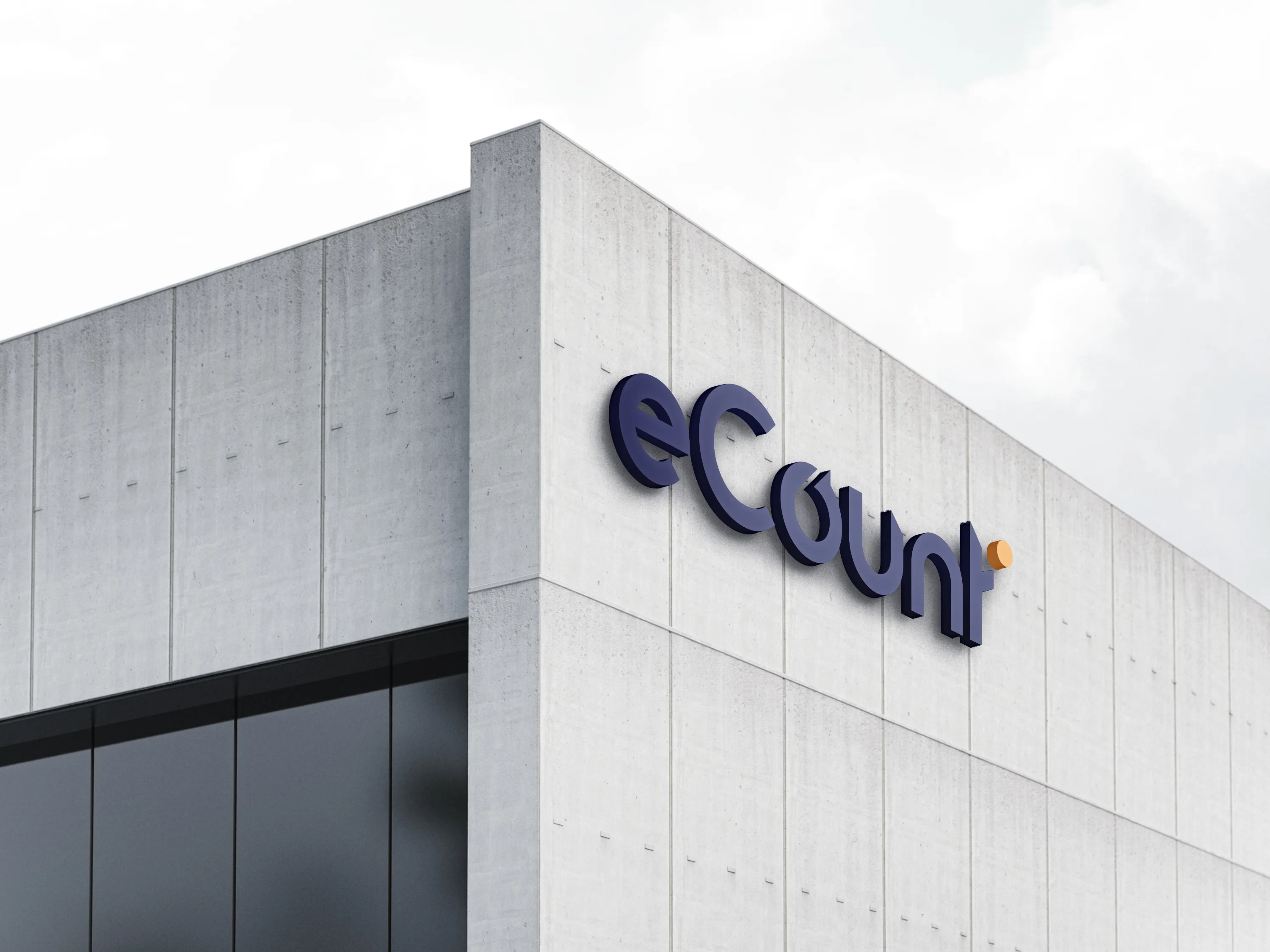
eCount is a UAE-based financial expertise brand redefining trust, clarity, and innovation in the world of finance. Its identity mirrors the company’s meticulous approach to numbers and strategy: a minimal, modern wordmark, fully custom-drawn, set in white against a deep navy field and finished with a single warm orange accent.
Client:
Stratify eCount Accountants LLC
Scope:
Branding & Identity
Industry:
Financial Expertise / Accounting & Advisory
Timeline:
1 Week
Designing the identity for eCount meant giving financial expertise a fresh, human face. Finance is often seen as complex and closed, while eCount’s promise is the opposite: trust, clarity, and confident decisions built on well-understood numbers. We began by studying that mission at its core, which is turning financial data into insight clients can act on. Every design decision needed to reflect the same meticulous approach eCount brings to numbers and strategy.
As the concept evolved, we focused on precision and restraint. Rather than relying on a symbol, we built the identity around a fully custom-drawn wordmark, shaped letter by letter to feel balanced, modern, and confident. The result is a minimal, rich-in-meaning identity that communicates accuracy without complexity, giving the brand a trusted presence across everything from reports and presentations to digital platforms and signage.
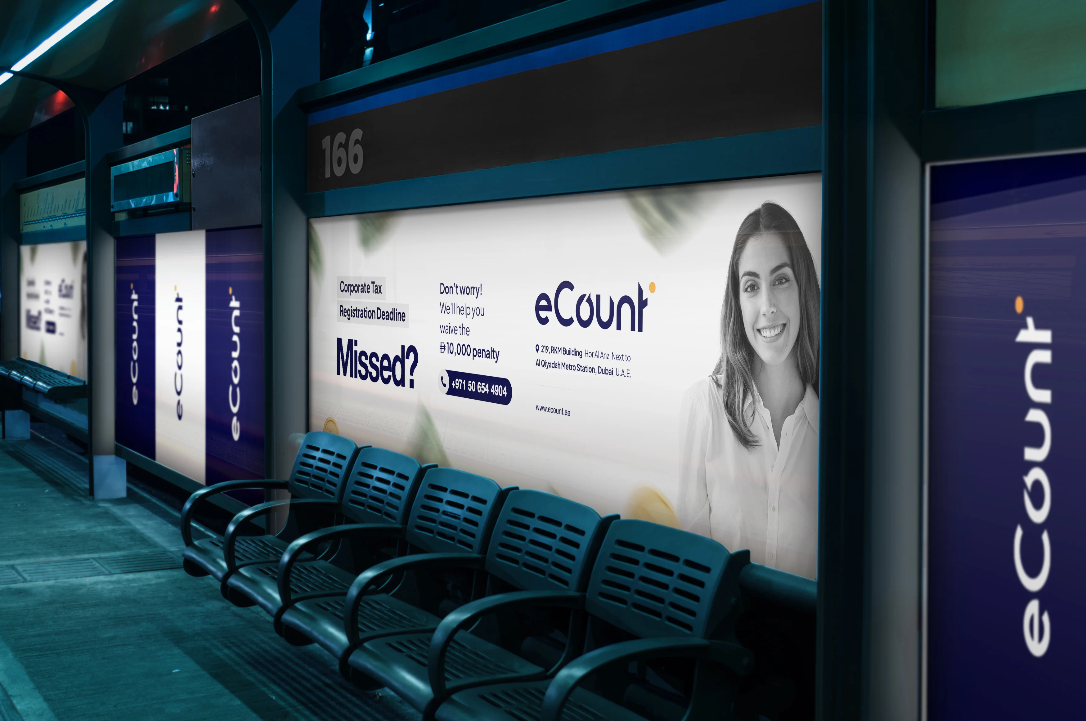
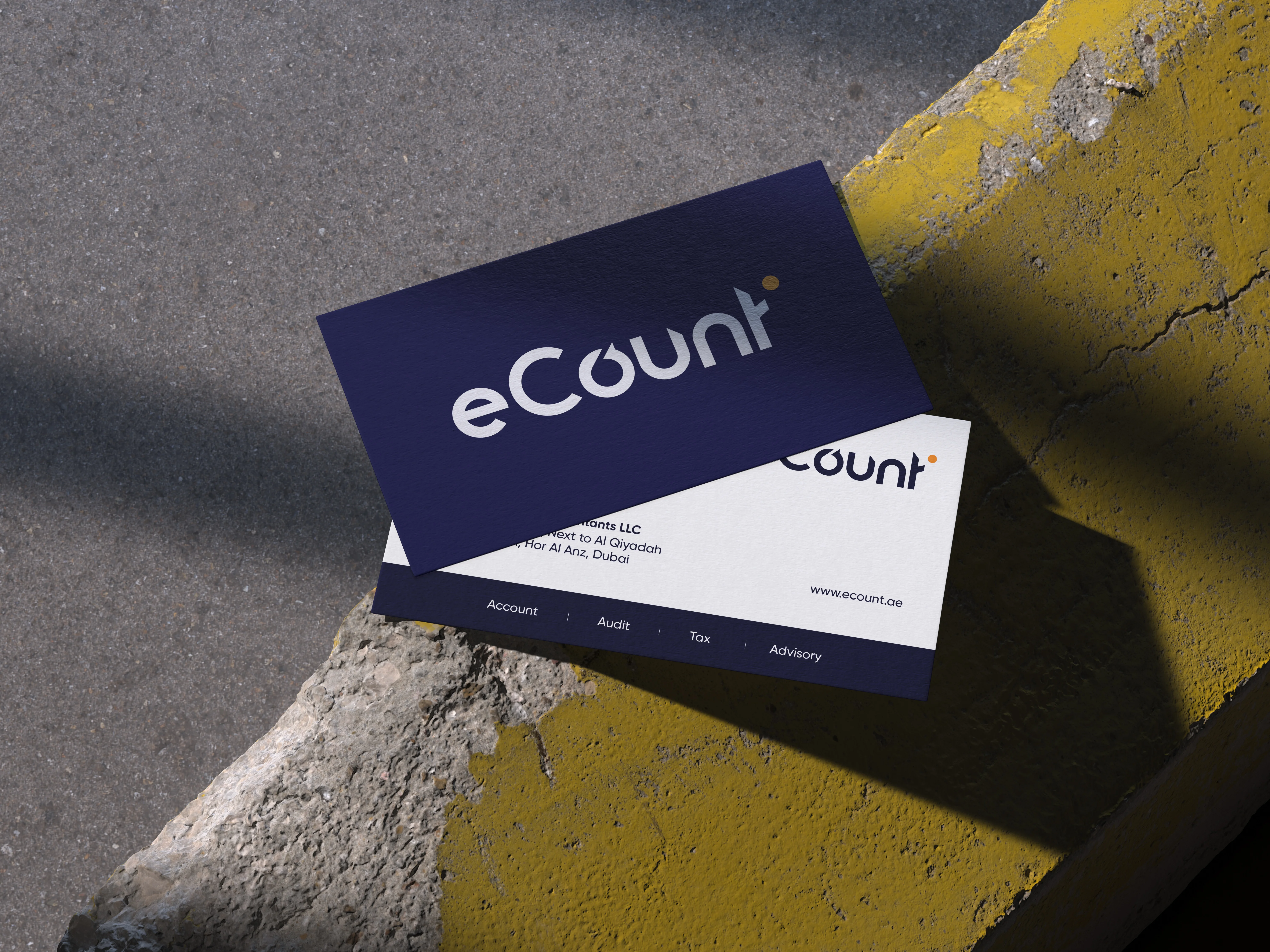
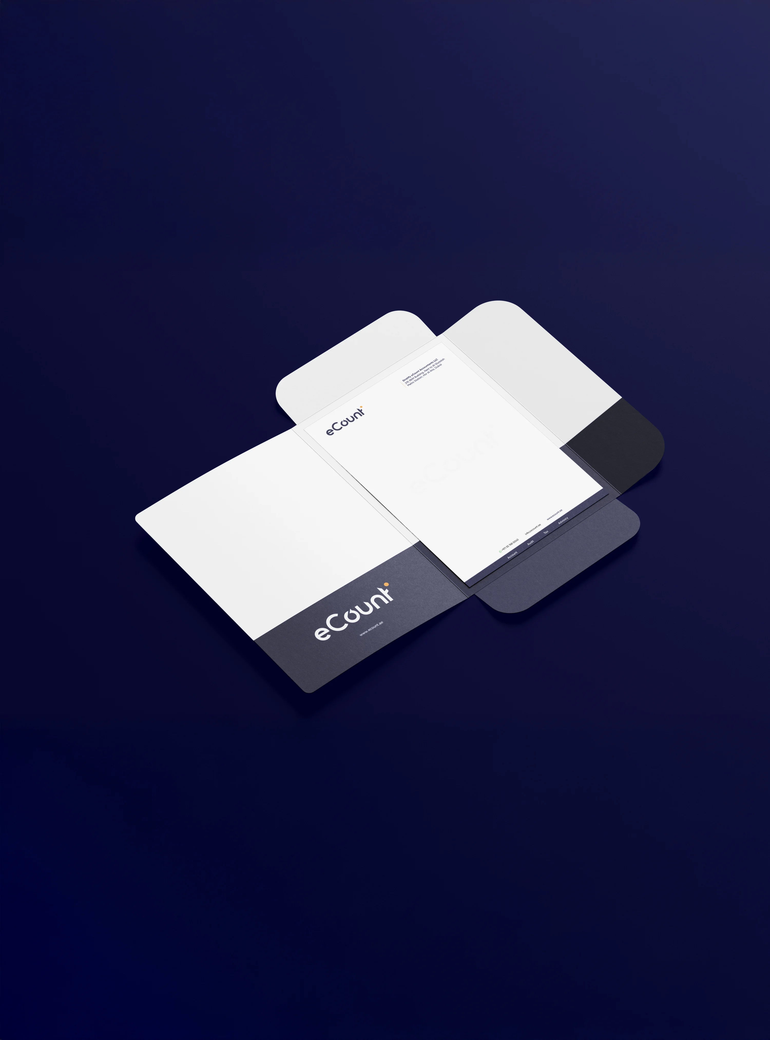
The eCount logo is built around a single guiding idea: simplicity with meaning. The custom wordmark is drawn with deliberate curves and clean details, each speaking of accuracy, growth, and transparency, the values of a trusted financial partner. The rounded letterforms keep the brand approachable, while the precise spacing and proportions signal balance and confidence.
The supporting choices reinforce this sense of calm authority. The deep navy palette conveys stability, credibility, and professionalism, while the small orange accent adds a spark of energy and optimism, a reminder of the insight and forward thinking behind the numbers. Together, the wordmark and colour form an identity that feels precise rather than rigid, representing how eCount transforms financial data into confident decisions.

The Branhaus Experience

"Branhaus truly understands branding. They listened to our vision and turned it into something even better than we imagined."


"Branhaus helped us re define our brand of TNM Online Solutions! Highly recommended for corporate branding."

"Exceptional creativity backed by a professional approach. Branhaus helped us build a brand identity we're proud to represent."

"What we appreciate most about Branhaus is their commitment to getting every detail right. They consistently deliver thoughtful, high-quality work with a level of professionalism that's hard to find."