Branding & Identity
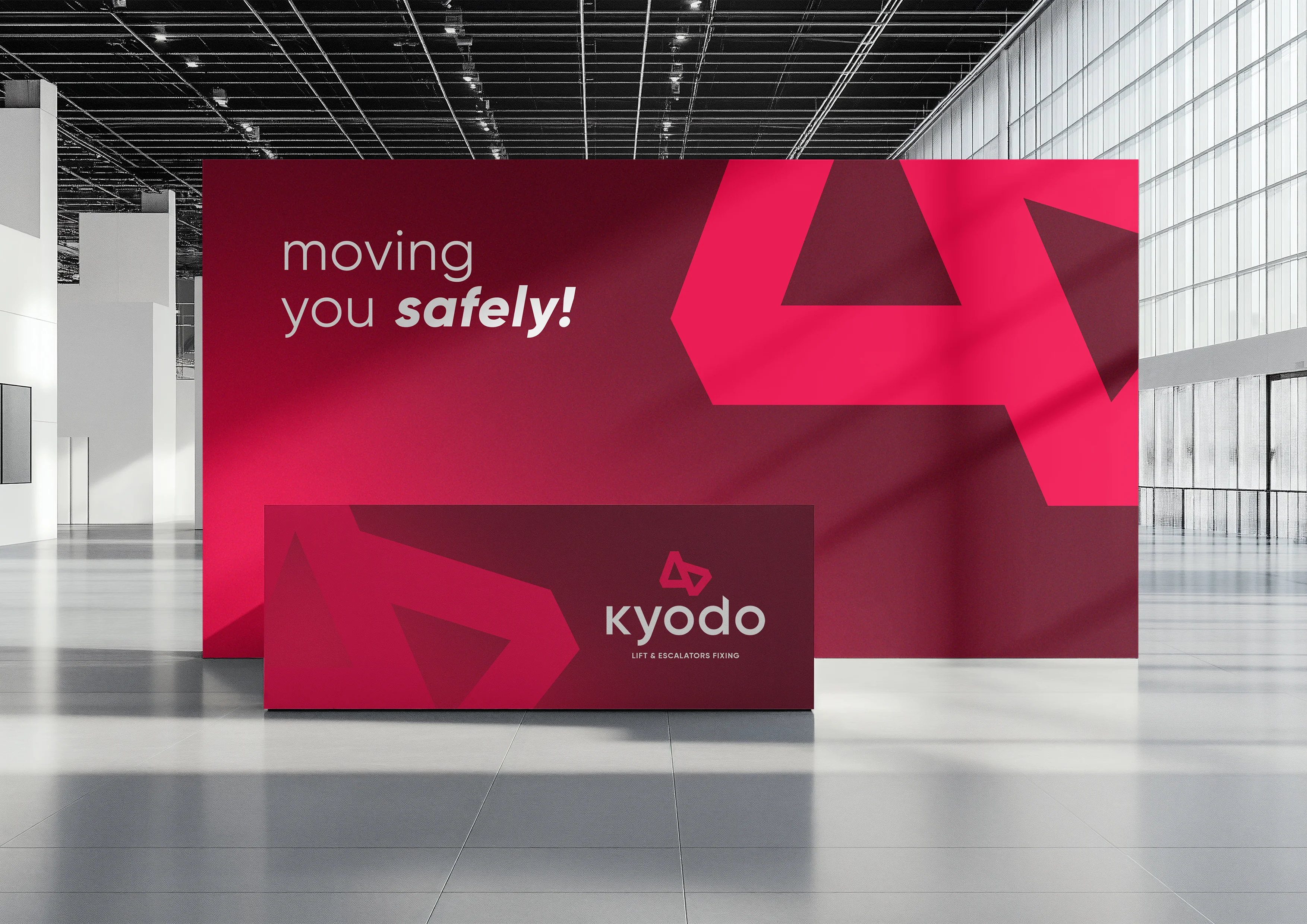
Kyodo Lift is a lift and escalator company built on motion, precision, and progress. Its identity draws on the upward movement of lifts and the seamless flow of escalators: a bold geometric mark with clean structure and sharp angles, paired with a confident lowercase wordmark in a vivid crimson palette.
Client:
Kyodo Lifts & Escalators Fixing LLC
Scope:
Branding & Identity
Industry:
Lifts & Escalators / Vertical Transportation
Timeline:
2 Weeks
Designing the identity for Kyodo Lift meant capturing the reliability of vertical transportation in a single, unmistakable mark. People step into a lift or onto an escalator without a second thought, and that quiet trust is exactly what the brand stands for. We began by studying that mission at its core: smooth movement, engineering excellence, and safety that is felt rather than noticed. Every design decision needed to reflect the same rigor Kyodo brings to its work.
As the concept evolved, we focused on translating upward motion and continuous flow into visual form. The result is a bold geometric mark made of sharp, interlocking angles that suggests lifts rising and escalators gliding. Paired with a clean, approachable wordmark, the identity balances modern innovation with simplicity and clarity, giving the brand a confident presence on everything from product panels and equipment to site signage and corporate stationery.
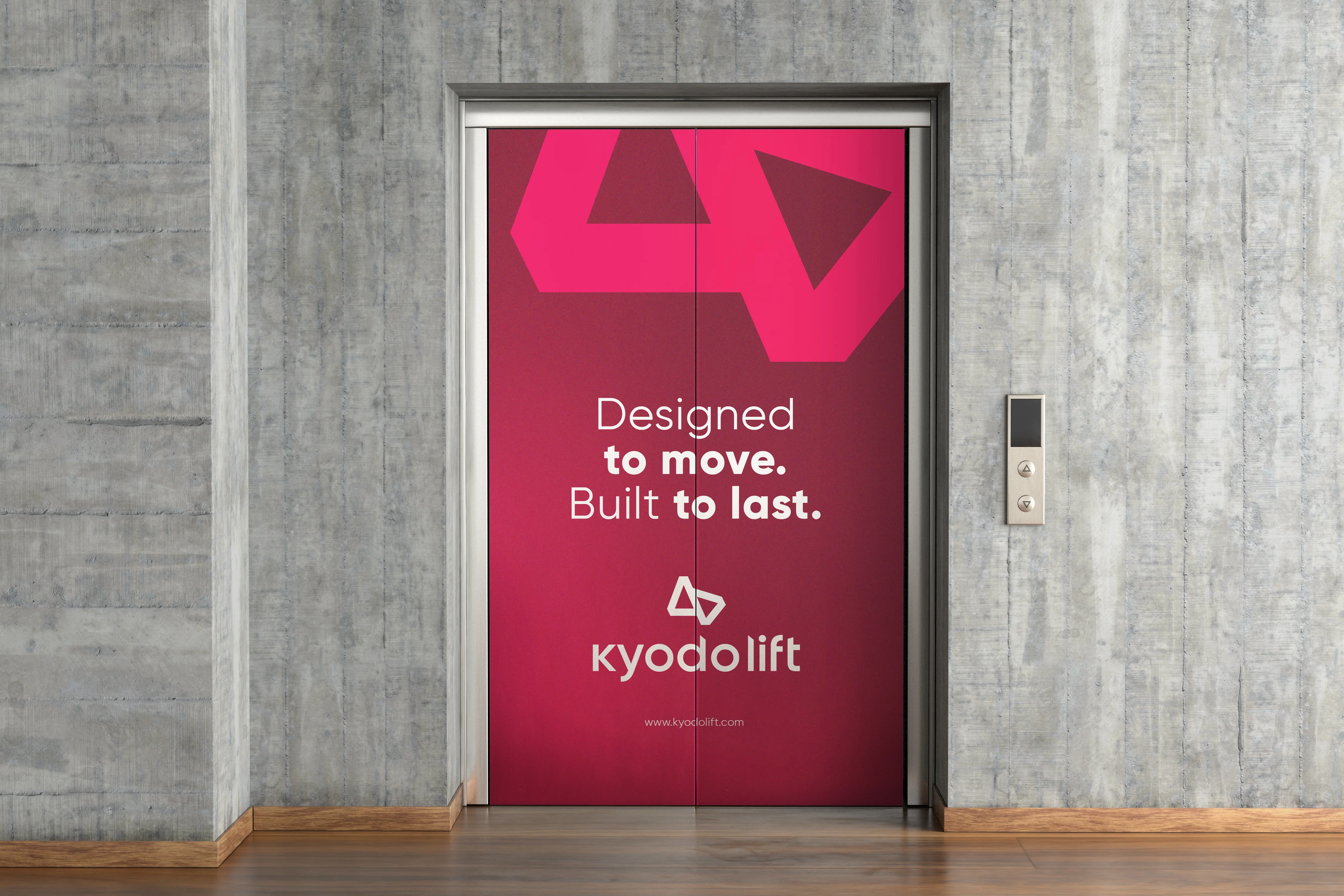
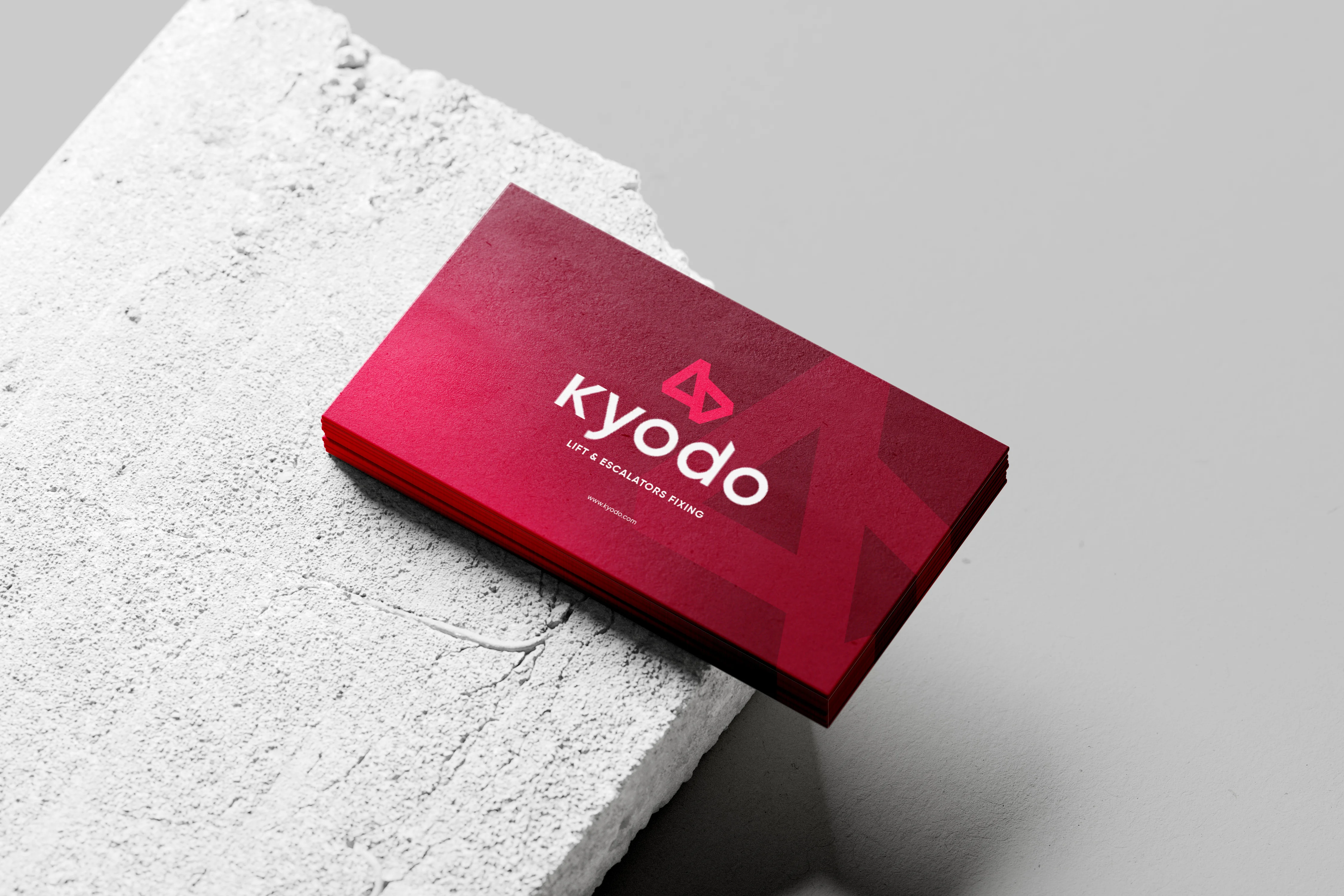
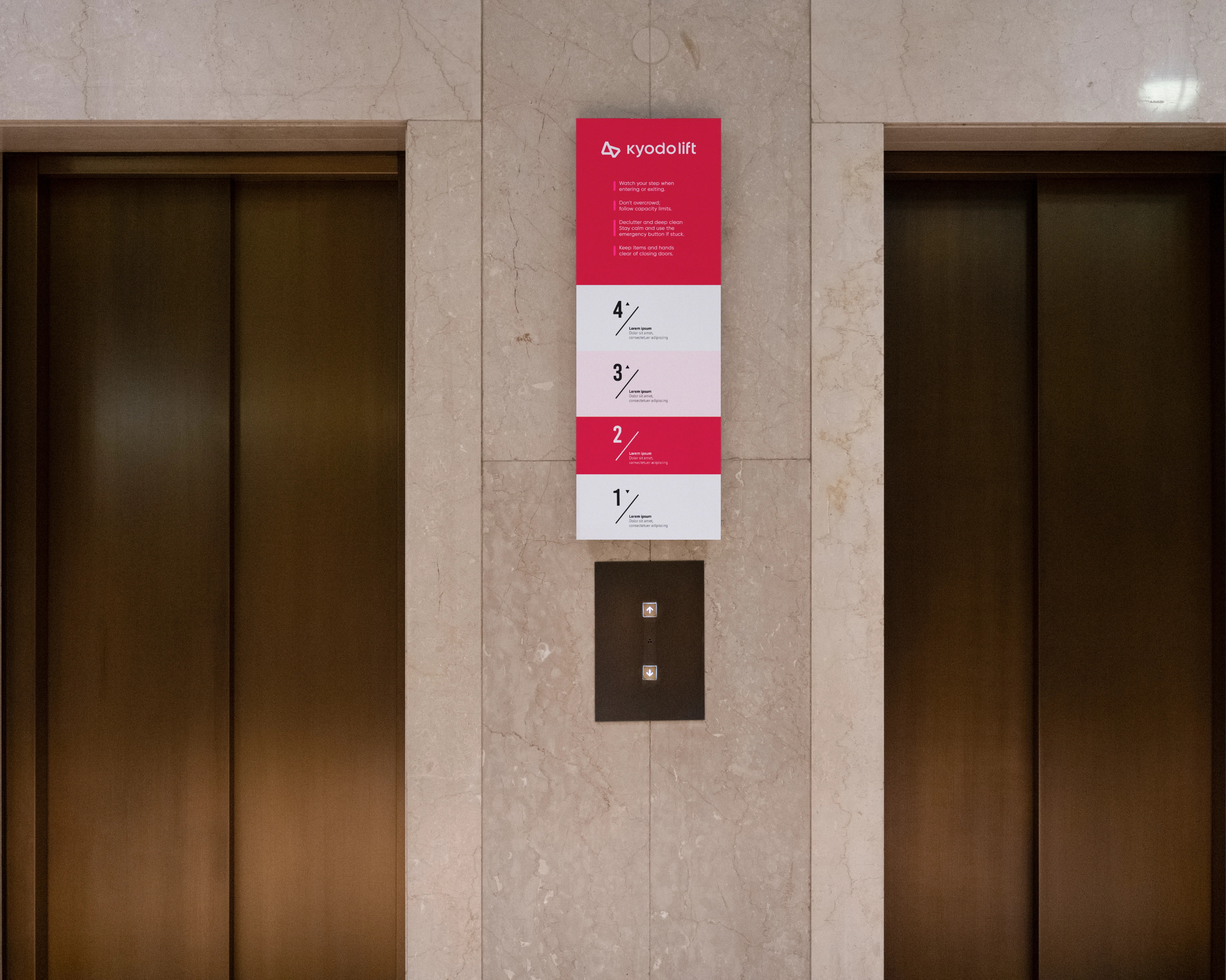
The Kyodo Lift logo is built around a single guiding idea: elevating everyday movement. The angular symbol represents the upward travel of lifts and the continuous flow of escalators, a visual shorthand for the technology at the heart of the company. Its clean structure and sharp angles convey strength, stability, and technical perfection, the core qualities of the Kyodo brand.
The supporting choices carry the same confidence. The lowercase wordmark is soft and approachable, balancing the precision of the symbol with a human, trustworthy tone. The deep red palette adds energy, boldness, and momentum, while darker tones in the pattern give the identity depth and weight. Together, the mark and wordmark form an identity that feels engineered rather than decorated, representing Kyodo’s vision of elevating everyday movement through precision, design, and trust.

The Branhaus Experience

"Branhaus truly understands branding. They listened to our vision and turned it into something even better than we imagined."


"Branhaus helped us re define our brand of TNM Online Solutions! Highly recommended for corporate branding."


"Exceptional creativity backed by a professional approach. Branhaus helped us build a brand identity we're proud to represent."

"What we appreciate most about Branhaus is their commitment to getting every detail right. They consistently deliver thoughtful, high-quality work with a level of professionalism that's hard to find."